Wooyang Art Museum: The Infinite Loop of Tradition and Modern Art

Project Type
Museum Rebranding, Identity System
Role
Brand Strategist, BX Designer
Tools
Illustrator, Photoshop, After Effect, Firefly
Overview
Back in 2013, I joined forces with the design team to redefine the Wooyang Art Museum,
located in the historic heart of Gyeongju, South Korea.
What made this project so fascinating to me was the unique nature of working with a 'museum', it required a delicate balance between preserving deep heritage and embracing the future.
We set out to transition the museum from its traditional,
static image into a dynamic 'Seamless Experience.' By integrating Gyeongju’s rich historical context with a modern, digital-first approach, we made the museum’s legacy feel more accessible and engaging for today’s audience.
Strategy & Research
The Challenge
When we first looked at the existing brand, we noticed a clear gap.
It felt a bit disconnected from both the fast-paced digital landscape and the evolving cultural vibe of Gyeongju. The museum needed to stay rooted in its history but stop feeling 'stuck' in the past.
The Strategy
Our move was to shift the narrative from being just 'Traditional' to truly 'Timeless.'
To get there, we did a deep dive into Gyeongju’s local values and the museum's modern goals, aiming for what we called 'Balanced Modernity.' The core of our strategy was all about the connection—building a seamless bridge between the physical gallery walls and every digital touchpoint to ensure a unified, intuitive journey for every visitor.
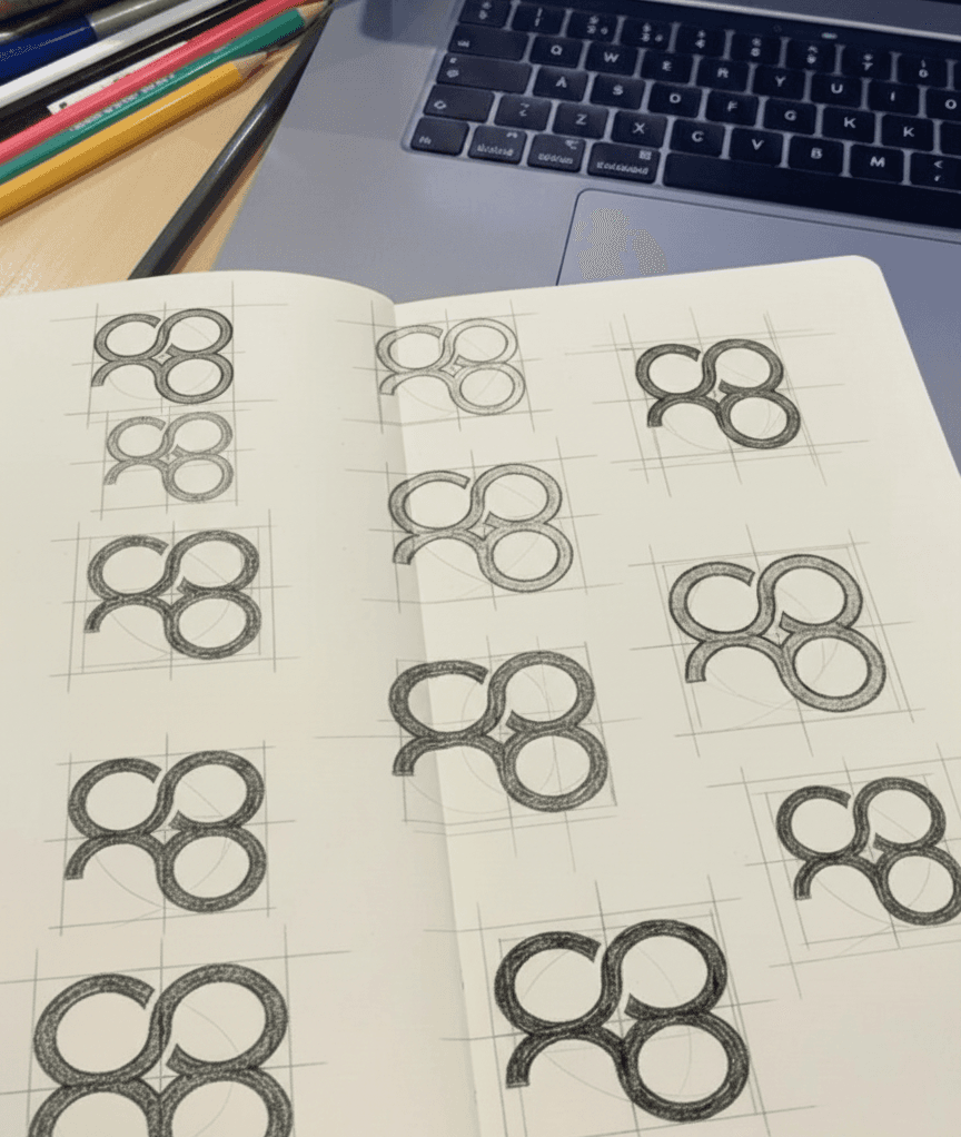
Design Concept
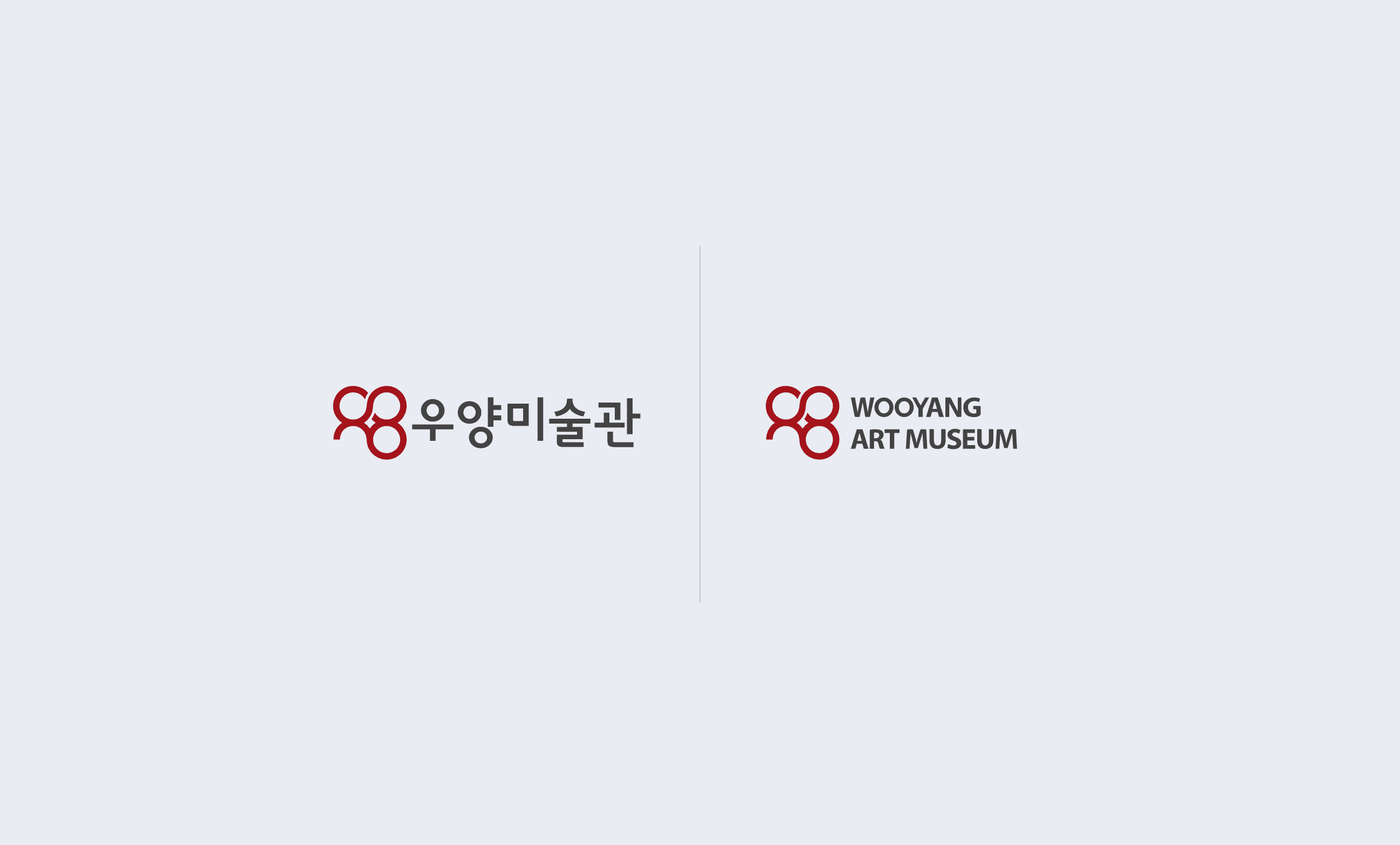
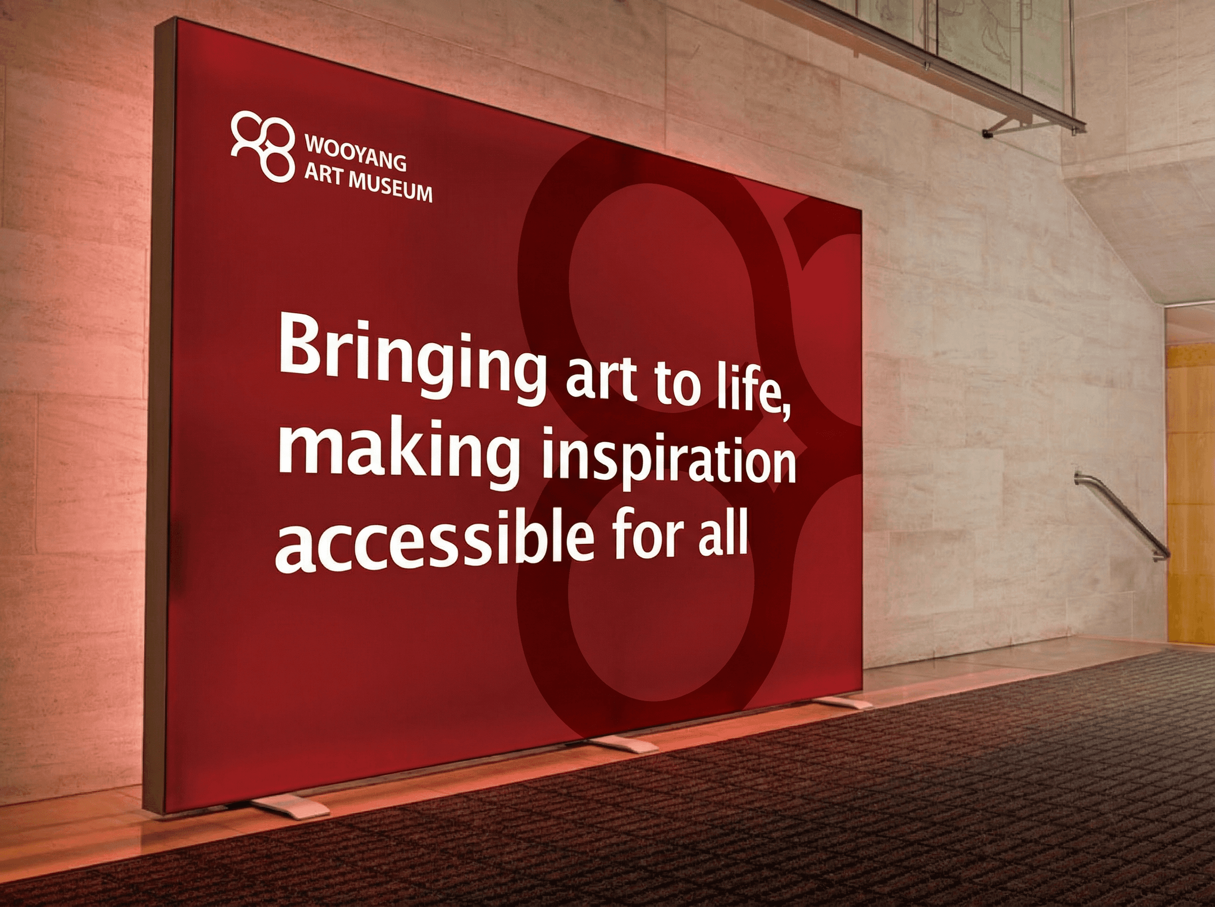
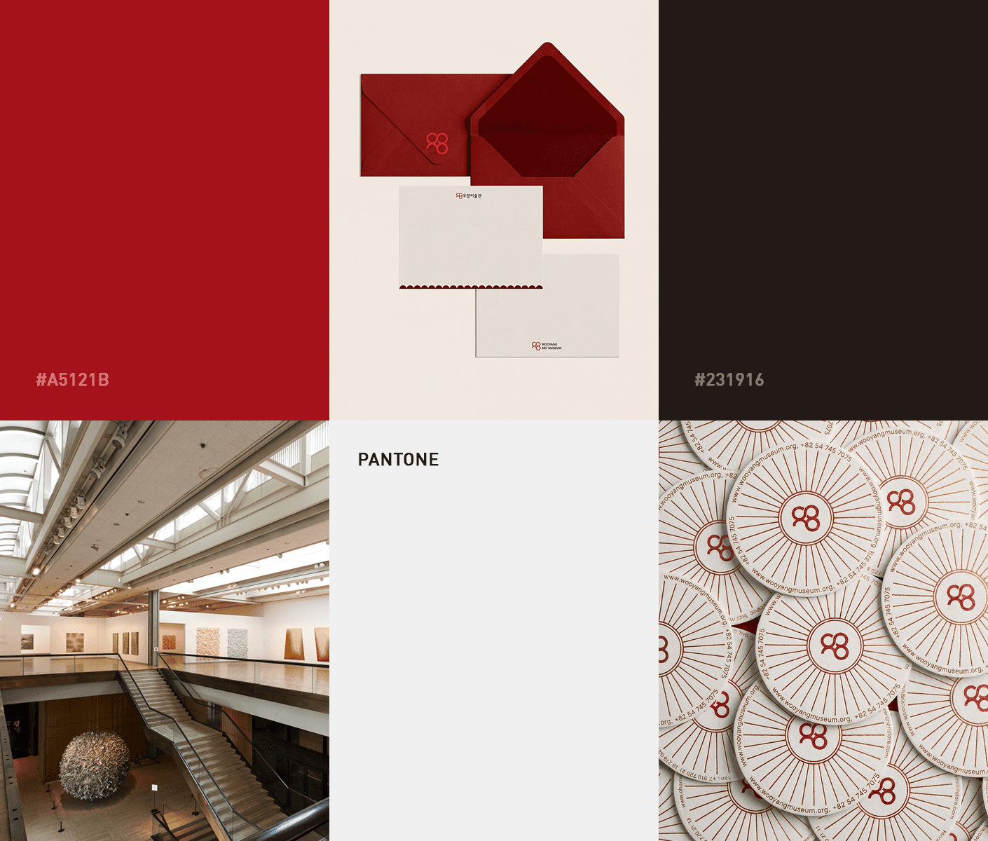
For the visual identity, we had a clear mission from the client: preserve the readability of the Korean characters '우양' (Wooyang) while giving the museum a fresh, symbolic edge. They also specifically requested a bold red palette to align with their broader business identity.
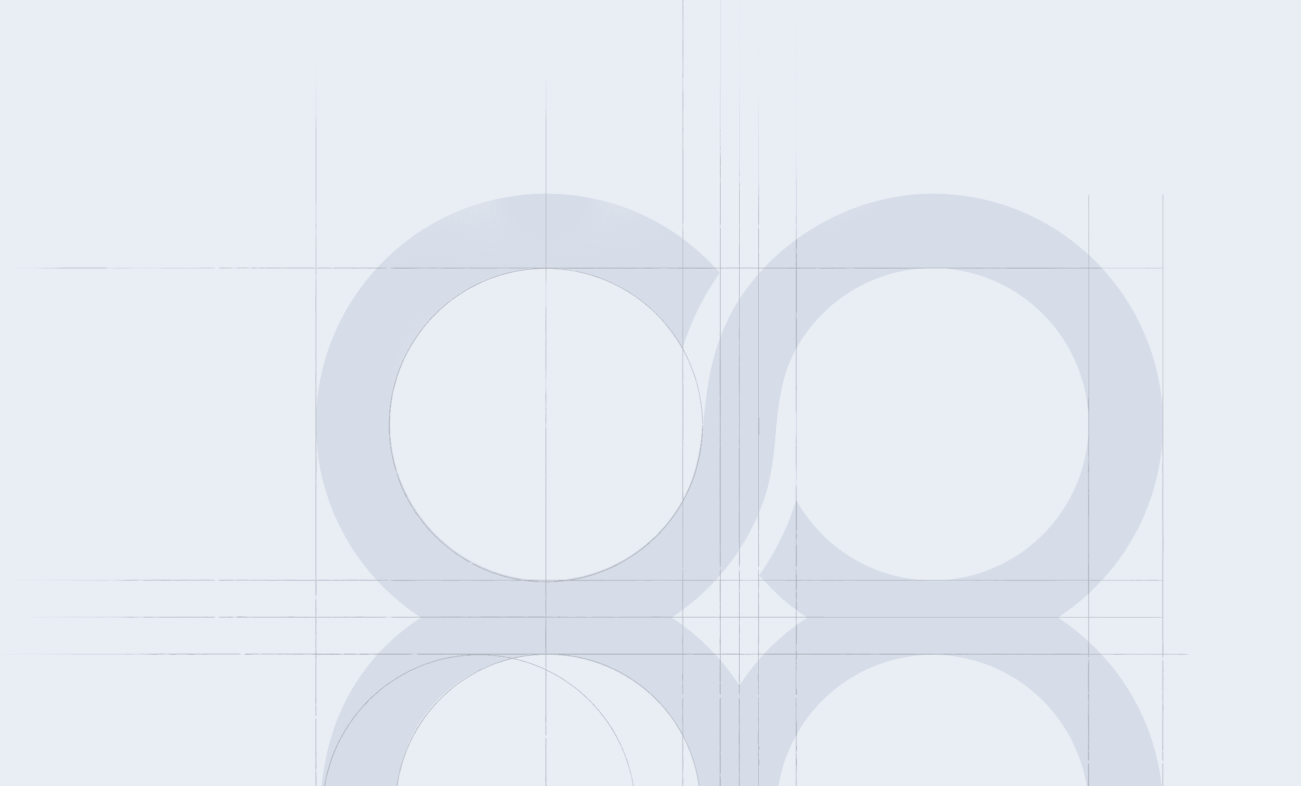
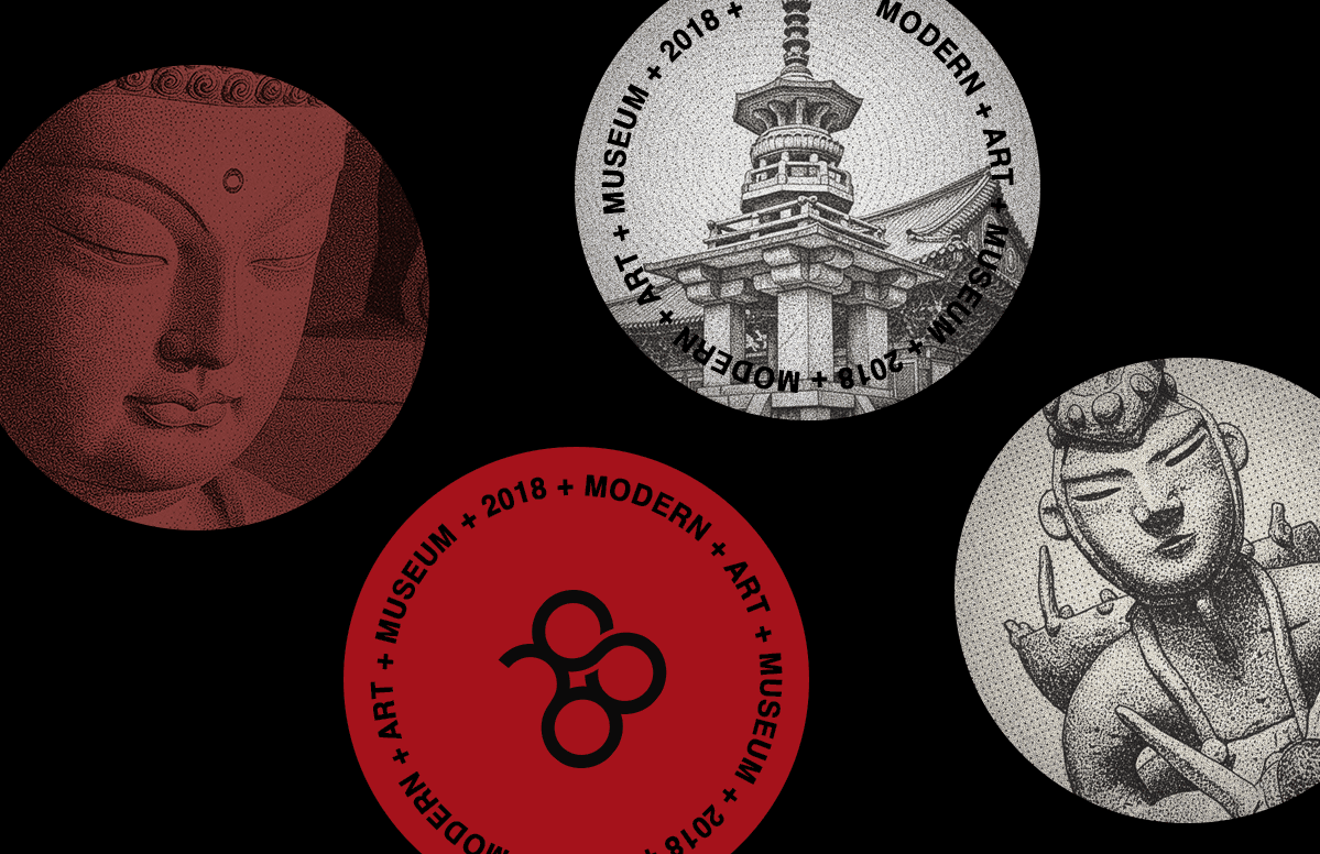
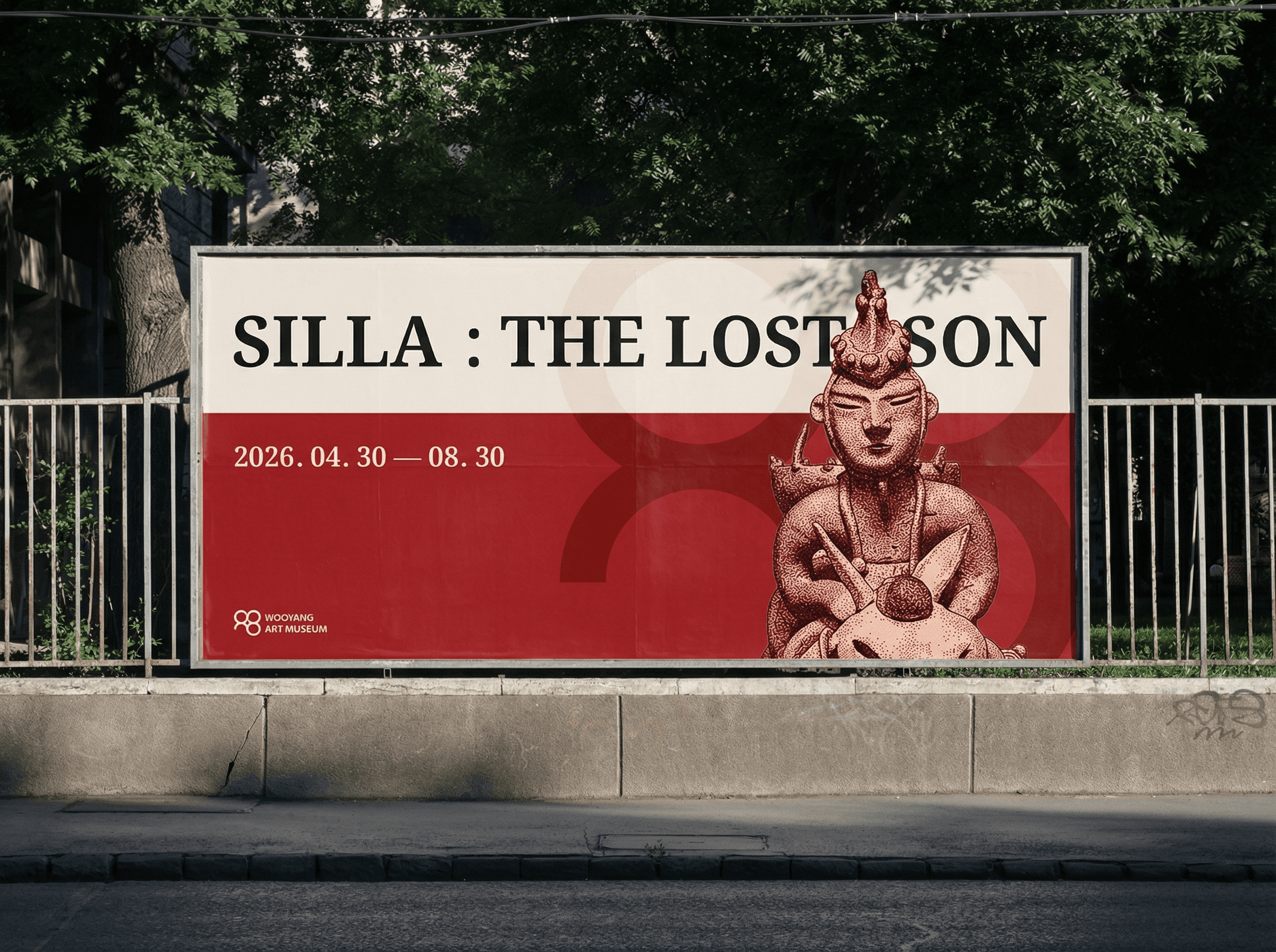
Our solution was to reinterpret the letters into a Möbius strip. This rhythmic, looping form represents an 'Infinite Timeline'—a seamless flow between the past, present, and future of Korean modern art. By using the client’s signature red in this fluid shape, we created a visual system that feels both authoritative and full of energy, symbolizing infinite growth and cultural continuity.
Conceptual Visualization Notice Brand Identity by Wooyang Art Museum. The imagery presented here is part of a comprehensive design study aimed at optimizing the visitor experience. These assets are featured for conceptual visualization and art direction purposes to showcase the brand's full potential. Please note that actual on-site implementation and final materials may vary based on environmental factors.