Redesigning the Pro Breeze Scheduling Experience

Project Type
Feature-Specific Redesign
Role
UX Researcher, UX/UI Designer
Tools
Figma, Illustrator, Photoshop, Claude
Overview
I purchased a Pro Breeze radiator, and honestly, I’ve been quite happy with the hardware. The core smart features—like setting schedules and the reliable connection between the device and the app—work great and have genuinely improved my home comfort.
However, as I integrated it into my daily routine, I encountered some significant UX hurdles.
As a user and a designer, I realized that documenting these pain points and proposing solutions would make for an excellent UX case study. My goal is to explore how to transform a functional but complex interface into one that feels truly intuitive.
The Problem
No clear language — "Action" doesn't tell users they're creating a schedule or automation. The word means nothing in this context.
Developer logic, not human logic — Asking users to choose between "Less than," "Equal to," and "Greater than" to set conditions is cognitive overload. Nobody thinks about temperature this way.
No visual hierarchy — Everything is the same flat text list. There's no visual cue to help users understand what's important, what's selectable, or where they are in the process.
Flow-breaking popup — The single vs. multiple device choice appears mid-flow, out of nowhere, before the user has even picked a device. It interrupts the task before it's started.


Information Density Analysis
My initial observations pointed to the same four problems — but gut feeling isn't a design brief. So I ran an Information Density Analysis across all four configuration screens to put numbers behind what I was seeing. I evaluated each screen across two dimensions — Cognitive Load (number of simultaneous decisions required) and Decision Complexity (how much domain knowledge a user needs to complete each step) — scoring each on a scale of 0 to 100, where higher scores indicate greater difficulty.
The results confirmed it. The Schedule and Weather flows scored 60/100 and 55/100 on Cognitive Load, and 65/100 and 55/100 on Decision Complexity — both well above the moderate threshold. The culprit? The Primary and Secondary Configuration tiers, where users are hit with too many technical input fields at once, in a single view, with no guidance on what matters most.
This wasn't just a visual problem. It was a structural one. And that finding became the foundation for everything that followed.
Competitive Audit
Before jumping into solutions, I looked at how three leading smart home apps handle the same problem — Philips Hue, Dyson, and Xiaomi Mi Home.
I intentionally kept my scope narrow. Rather than benchmarking broad platforms like Google Home or Samsung SmartThings, I focused on apps that are known specifically for translating complex device configurations into intuitive, everyday experiences.
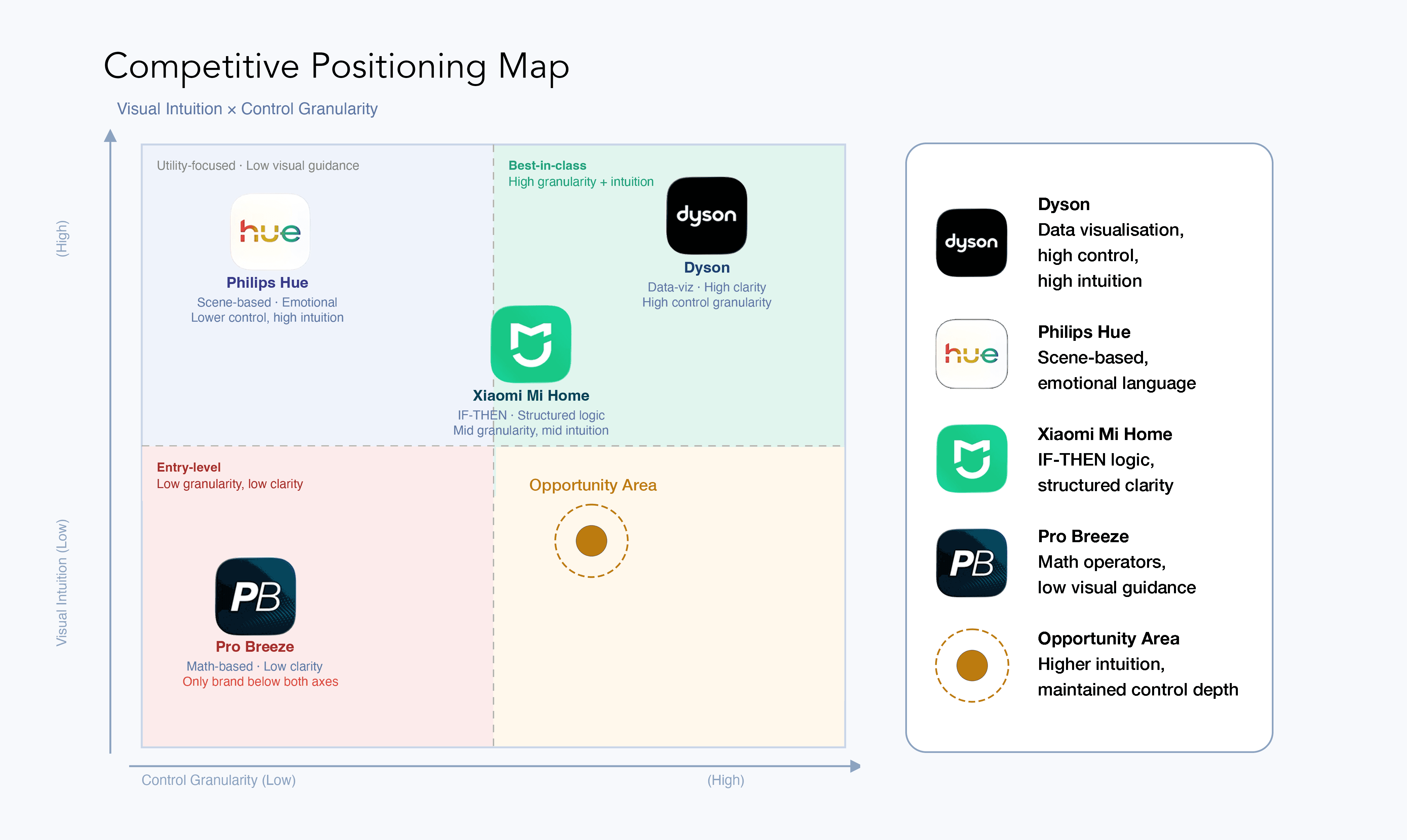
Brand | Strategies | Visual | Summary |
|---|---|---|---|
Pro Breeze | Math operators | Text only, Static | Purely functional, text-heavy interface lacking visual hierarchy. |
Philips Hue | Scenario-Based | Colour, Lighting Effects | Uses emotional phrases like "Create an Arctic Aurora mood" instead of "Turn on the light," and links timers to natural phenomena like sunrise/sunset. |
Dyson | Data Visualization-Centric UX | Real time air quality animation | Prioritizes showing current air quality or temperature through elegant graphs and colorus before the ON/OFF switch, using highly intuitive sliders. |
Xiaomi Mi Home | Logic Oriented (IF-THEN) | Icon-driven card UI | Clearly structures automation in a readable "IF [Condition] → THEN [Action]" format to make user-defined settings logical and transparent. |
What the research revealed
The gap between Pro Breeze and its competitors came down to one thing:
whose mental model the app was built around. Pro Breeze was built around the machine.
Its language — "Action," "Less than," "Equal to" — reflects how the system stores data,
not how a person thinks about their home.
The three competitors solved this differently, the solution was clear: complexity is best handled through structure.
Philips Hue | Dyson | Xiaomi Mi Home |
|---|---|---|
Emotional | Leads with | Explicit |
Scene-based language | Visual data first | IF→THEN logic |
That last point became the guiding principle for this redesign.
"How do I improve this flow without relying on animations, visual effects, or decorative UI?"
This constraint was intentional. Pro Breeze is a utility app, not a lifestyle brand — and most of its users are setting up schedules once and moving on. I wanted to prove that clarity alone, without visual decoration, could carry the experience.


Mapping the journey — before and after.
My focus: Information Architecture and UX Writing — restructuring how information is presented, and rewriting the language the app uses to communicate with its users.
User Flow Analysis
The original 8-step automation flow was exhausting for users. Due to vague labels, no visual cues, and technical jargon, setting a schedule was a chore. I redesigned this into a 3-step flow by asking one question per screen. This new approach eliminates pop-ups and dead ends while keeping the user’s progress visible at all times.
Information Architecture
The IA diagram shows where the scheduling flow sits within the broader app structure, and how the internal hierarchy of the New Automation flow was restructured.
The key change isn't the number of screens — it's the logic behind them. The original app grouped all configuration options onto a single screen, leaving users to figure out what was required versus optional. The redesign separates each decision into its own step, using progressive disclosure to surface only what's needed at that moment.
The result is an architecture that feels lighter, even though the underlying functionality is the same.

Design Strategy & Solutions
To eliminate the 'mechanical coldness' of the original app, I replaced "Action" with "Flow" — a word that implies continuity and purpose, not a system event. Where the original app asked users to configure a machine, the redesign invites them to fit automation into their day.
The addition of a tactile temperature wheel provides instant feedback, and the 3-step progress bar visually confirms a simpler journey. By streamlining the flow from 8 steps down to 3, I've reduced cognitive load and ensured a frictionless path to the user's goal.

Final Design
The redesigned flow has three distinct, clearly labelled screens — and every screen asks only one thing of the user.
Screen 1 — My Flows
The entry point greets users with their existing automations as named cards — "Sunrise Glow," "Night Guard" — each with a plain-English description. A single "Create Flow" button initiates the process.
Screen 2 — Select Your Flow
Where the original app presented a flat, ambiguous list, the redesign offers four large icon-driven cards — Manual Tap, Device Status, Schedule, and Weather — each with a one-line description beneath it. The options map directly to how users actually think about automation: "I want it to run on a timer" or "I want it to react to the weather." The cognitive work of interpreting technical labels is gone. You see it, you tap it.
Screen 3 — Setup Your Flow
This is where the most significant UX shift happens. Instead of asking users to choose between abstract operators like "Less than" or "Equal to," the redesign introduces a tactile temperature wheel — a large, draggable arc that displays the target temperature as a bold, readable number at the centre. The selected device appears as an inline card at the top, confirming context without a separate step. Below the wheel, users can name their flow, choose an icon, and toggle notifications — all in one place. The "Save Flow" CTA closes the journey cleanly.
The result is a flow that went from 8 steps of technical input to 3 screens of single-question decisions — same functionality, fundamentally different experience.


Conclusion & Takeaways
UX problems are often language problems. This project proved that while the original app functioned well, its 'mechanical' vocabulary hindered the experience. Swapping 'Less than' for 'Drops below' wasn't a visual update—it was a fundamental shift in building user trust.
I also learned that interruptive popups often signal a deeper structural failure.
The need for a selection popup disappeared once I re-anchored the device selection within its natural context. Solving the root structural issue is always more effective than patching the UI.
Instead of a broad overhaul, I focused on the single most painful point of friction. This deliberate scope allowed for a surgical and highly effective solution. Small scope, real impact—this is the kind of design work that truly excites me.